This post explains how I designed and built the new Apple-style dual-time web clock on my homepage, from its visual decisions to the time-zone and rendering logic behind it.
The clock now sits directly below the search box on the desktop version of the homepage. It compares the visitor’s current time with “My time” using two analog dials, while deliberately avoiding a widget title, a personal name, or a country label.
It is a small addition, but it brought together more interesting problems than its size suggests: browser time zones, daylight-saving changes, analog geometry, light and dark presentation, responsive layout, bilingual text, and accessible live information.
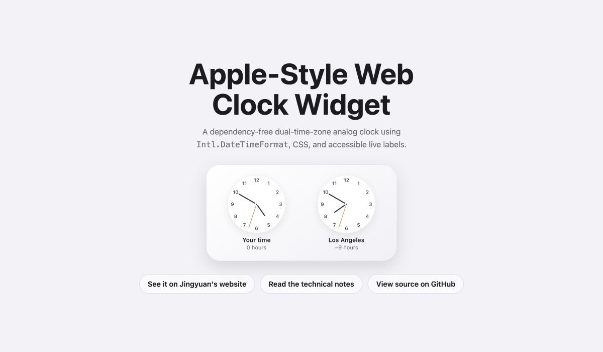
The reusable source code is now available on GitHub: Jingyuan-Zheng/apple-style-web-clock-widget. The MIT-licensed repository includes a standalone demo, framework-free CSS and JavaScript, bilingual documentation, configuration examples, and tests for time-zone and hand-angle calculations.
A Familiar Interface Without Copying an App
The visual direction is clearly inspired by Apple’s clock interfaces: circular faces, thin hands, restrained typography, a bright orange second hand, and a rounded card with soft depth.
The goal was not to reproduce a specific Apple screen pixel for pixel. It was to borrow the qualities that make those interfaces immediately understandable:
- the clock should be recognizable before any text is read;
- the two time zones should feel related but remain visually distinct;
- labels should explain only what the user needs;
- decoration should never compete with the hands or numerals.
That is why the visible copy is reduced to “Your time” and “My time.” A heading such as “World Clock” would repeat what the two dials already communicate, while a personal name or country would add visual noise and expose more context than the widget needs.
One Instant, Two Wall Clocks
The most important technical decision is to treat both dials as two views of the same instant.
Every update starts from one Date:
|
|
The visitor’s zone comes from the browser:
|
|
The second dial uses the time zone configured by the site. Both are passed through Intl.DateTimeFormat with formatToParts(), which gives numeric year, month, day, hour, minute, and second values for the selected IANA time zone.
This is safer than manually adding a fixed number of hours. A fixed +1 or +2 eventually becomes wrong when daylight-saving rules change. The Intl API lets the browser’s time-zone database resolve the applicable offset for the current instant.
Calculating the Time Difference
Displaying a wall-clock time is only half the job. The widget also shows the difference between the two zones.
For a target zone, the formatted wall-clock parts are reconstructed as if they were UTC:
|
|
The difference displayed under the second clock is then:
|
|
This also handles half-hour and quarter-hour zones. The output formatter keeps one decimal place when necessary instead of assuming that every time-zone difference is a whole number.
Turning Time into Hand Angles
An analog clock is mostly geometry. A complete circle is 360 degrees, so each minute or second represents 6 degrees, and each hour represents 30 degrees.
|
|
The small minuteAngle / 12 term matters. Without it, the hour hand would jump abruptly from one number to the next. Including it makes the hour hand travel gradually as the minutes pass.
Each hand is a narrow positioned element whose transform origin sits at its bottom center:
|
|
JavaScript only updates the custom property. CSS remains responsible for the hand’s shape, length, color, and positioning.
The numerals use the same separation of concerns. Hugo generates twelve repeated elements, CSS rotates each one around the dial, and an inverse rotation keeps the numeral upright.
The Site Theme and the Dial Theme Are Different
The component has two independent kinds of appearance.
The outer card follows the blog’s light or dark theme so that it belongs naturally in the sidebar. The clock face, however, follows the time shown by that particular clock:
- 07:00–18:59 uses a light dial;
- 19:00–06:59 uses a dark dial.
This distinction was important. If the entire widget followed only the website theme, switching the blog to dark mode would turn a daytime clock dark as well. That would remove useful information from the visual design.
Because each dial evaluates its own zoned hour, it is possible—and intentional—for one face to be light while the other is dark.
Recalculate Instead of Counting
The widget refreshes once per second with setInterval, but it never treats the previous tick as the source of truth.
Each tick creates a fresh Date and recalculates every hand from the current system time. If the browser delays a timer because a tab is in the background, the clock corrects itself on the next update instead of accumulating drift.
This also means daylight-saving changes and system time adjustments are picked up naturally. The interval is only a request to repaint; it is not the clock’s internal timekeeper.
Hugo Integration and the Desktop-Only Decision
The widget is implemented as a local Hugo partial and registered immediately after the search widget in the homepage configuration. This keeps the structure modular: the search component remains unchanged, and the clock can be moved or removed through the widget list.
The HTML contains the semantic structure and bilingual labels. SCSS owns the card, dial, hands, numerals, and theme states. TypeScript owns time-zone conversion and live updates.
The open-source version removes the Hugo dependency and exposes the same ideas through standard data-* attributes, so it can be embedded in an ordinary webpage without a framework or build step.
The blog’s right sidebar appears only at desktop widths of 1024 pixels and above, so the clock does not consume space on phones. This is an intentional product decision rather than an unfinished responsive state. On a small screen, the article list and navigation are more important than a decorative time comparison.
Small Accessibility and Localization Details
Animated clock hands are not enough for assistive technology. Each dial therefore receives an updated accessible label containing its name, digital time, and time difference. The visible difference line is hidden from screen readers to avoid announcing the same information twice.
The labels and hour units come from the current Hugo language:
- English: “Your time,” “My time,” “hour,” and “hours”;
- Simplified Chinese: “你的时间,” “我的时间,” and “小时.”
Time calculations deliberately use Latin digits and a Gregorian calendar internally. Presentation text remains localized without making the numeric parsing dependent on a browser’s display language.
What This Small Widget Taught Me
The main lesson was that a good widget needs boundaries more than it needs features.
I removed the title, personal name, country label, and mobile version. I separated website theming from day-and-night dial logic. I let the browser handle time-zone rules, while keeping the analog drawing in simple CSS and geometry.
The result is intentionally narrow: two clocks, one comparison, and no controls. That restraint is what lets it feel like part of the homepage instead of a miniature app competing with the rest of the site.
Small interface components are often where design and engineering meet most directly. Every extra label, timer, color rule, and breakpoint has an immediate visual consequence. Building this clock was a useful reminder that polish usually comes not from adding more, but from deciding what the component can leave out.